
Appearance
Survey designs
A survey design is the look of the survey card: its colours, corners, font, width, shadow and buttons. Start from one of eight prepared designs, adjust it to match your website while watching a live preview, and make one the default. Every survey of the website then uses it, unless a survey picks another design.
Where to find it: open Surveys for your website (for example Demo Plant Shop › Surveys) and click Designs at the top.
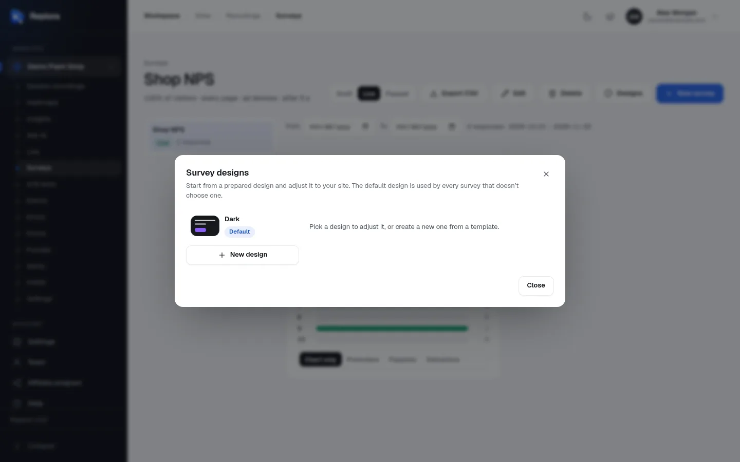
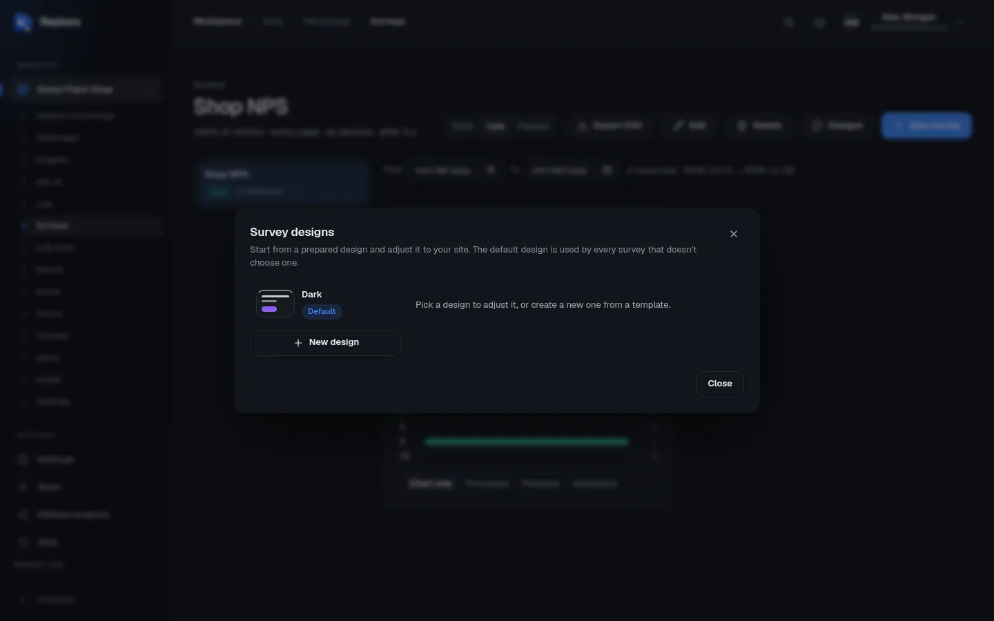
The designs dialog
| Part | What it does |
|---|---|
| List on the left | The website’s designs, the default first, each with a small swatch of its look and a Default badge on the default one. Click a design to adjust it. |
| New design | Shows the templates to start a new design from. |
| Choose a template to start from | The eight prepared designs (see below). Click one to start a design from it. Shown by itself when the website has no designs yet. |
| Create design / Save design | Saves the design being edited. |
| Delete | Deletes the design being edited (see Delete a design). |
| Close | Closes the dialog. |
The eight templates
| Template | Looks like | Suggested accent |
|---|---|---|
| Classic | White card with a soft shadow: fits most sites. The look surveys have without any design. | red #e5484d |
| Minimal | Flat, thin border, small corners and outlined buttons. | near-black #111827 |
| Dark | Dark card for dark sites, with a strong shadow. | violet #8b5cf6 |
| Soft | Warm colours, round corners, rounded letters and pill buttons. | orange #f97316 |
| Bold header | A band of your colour along the top: hard to miss. | blue #2563eb |
| Glass | See-through card over the blurred page. | sky blue #0ea5e9 |
| Compact | Narrow and quiet, for small screens and busy pages. | green #16a34a |
| Elegant | Serif letters, cream paper and outlined buttons. | brown #8b6f47 |
A template is only a starting point: every option below can be changed afterwards.
Create a design
- Click Designs, then New design (the templates show at once when there is no design yet).
- Click the template closest to what you want.
- Change the Name (it starts as the template’s name; up to 80 characters), for example Brand green.
- Adjust colours and shapes while watching the Live preview (you can click through it: Try it: answers here are not saved.).
- Switch on Default design of this site if every survey should use it.
- Click Create design.
The first design of a website automatically becomes its default.
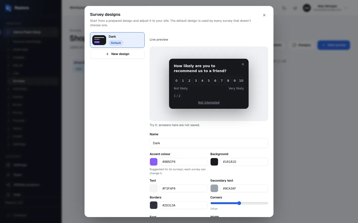
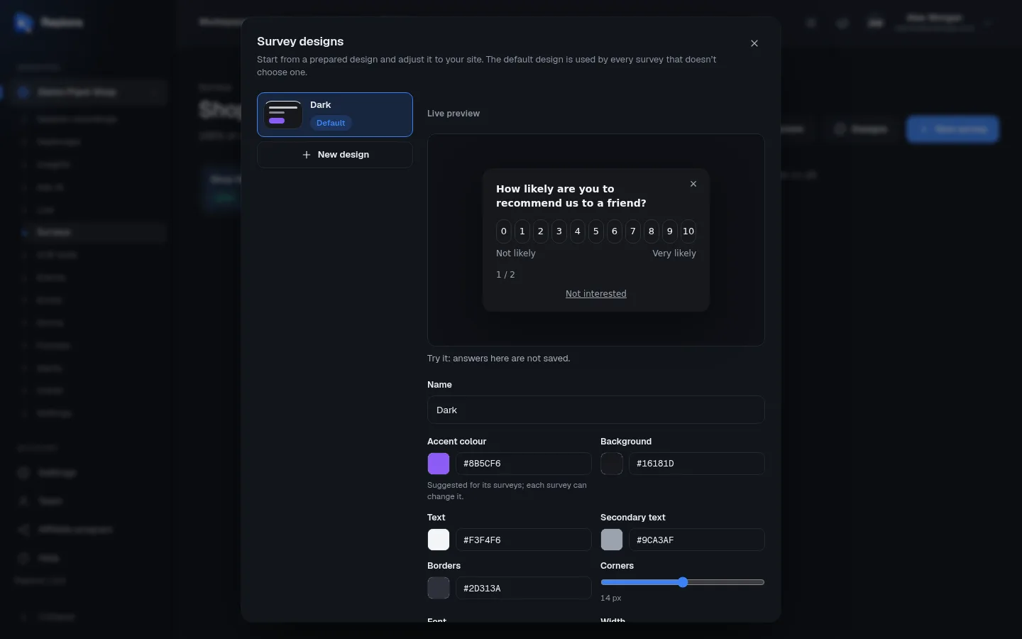
Every option
| Option | What it changes | Values |
|---|---|---|
| Name | What the design is called in lists. | Up to 80 characters, required. |
| Accent colour | The colour of buttons and highlights. Suggested for its surveys; each survey can change it: picking the design in a survey copies this colour into the survey’s Colour. | Colour picker or hex code (#8b5cf6). |
| Background | The card’s background. | Hex colour. |
| Text | The question and answer text. | Hex colour. |
| Secondary text | Smaller text: Not likely / Very likely, progress, links. | Hex colour. |
| Borders | Lines around the card and answer buttons. | Hex colour. |
| Corners | How round the corners are. | 0 to 28 px (Classic: 14 px). |
| Font | The letters. | System (the visitor’s usual font), Rounded, Serif, Monospace. |
| Width | How wide the card is. | Narrow, Normal, Wide. |
| Shadow | The shadow under the card. | None, Soft, Strong. |
| Buttons | The style of buttons. | Filled, Outline, Pill. |
| A band of the accent colour along the top | A coloured band across the top of the card (the Bold header look). | On / off. |
| See-through card over the blurred page | The Glass look: the page shows blurred through the card. | On / off. |
| Default design of this site | Used by every survey that doesn’t choose a design. Switching it on for one design switches it off for the previous default. | On / off. |
Readable colours
Keep enough contrast between Background and Text (dark text on a light card, or light text on a dark card), and check the preview on the Secondary text too: it is the first thing to become unreadable.
Use a design in a survey
In the survey editor, on the Appearance tab, choose the Design:
- Site default (name): follows whatever design is the website’s default, now and later.
- a design by name: the survey keeps that design even if the default changes.
Picking a design also sets the survey’s Colour to the design’s accent; you can still change the colour for that survey. See Surveys › Appearance.
Change or delete a design
- Click a design in the list, change it, and click Save design. Every survey using it shows the new look straight away.
- The default design can’t be un-set by its switch: make another design the default instead.
Delete a design
Delete asks “Delete this design?”. Its surveys use the site’s default design instead. If you delete the default design, the oldest remaining design becomes the default.
Limits and who can do what
- Up to 30 designs per website. Designs belong to one website: other websites of your account have their own.
- Managers and members create, change and delete designs. Viewers can open the dialog and look at the designs, but the fields are locked.